
Description
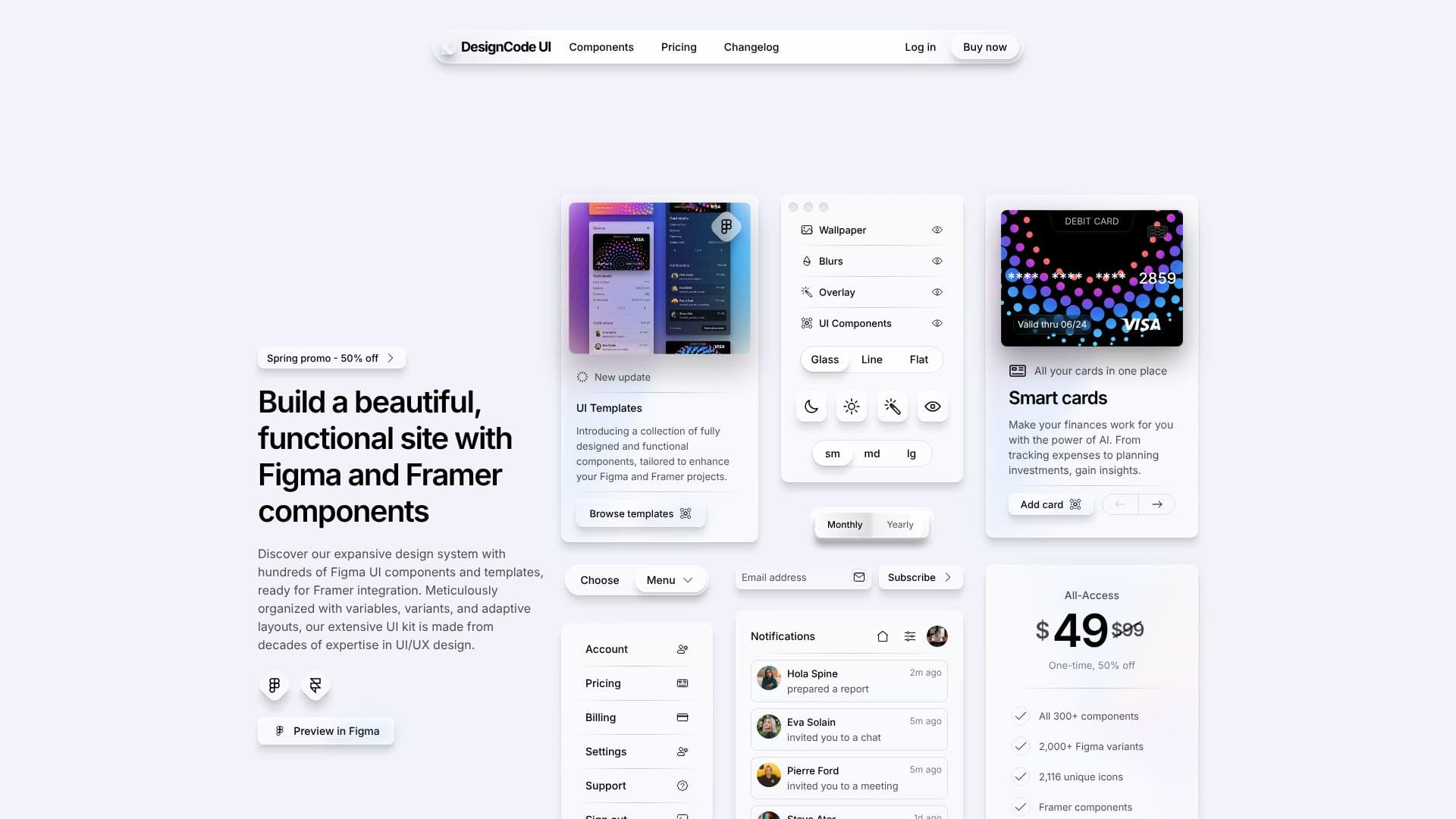
DesignCode UI provides an expansive design system featuring hundreds of meticulously crafted UI components and templates, ready for seamless integration into Figma and Framer projects. This extensive UI kit is the result of decades of expertise in UI/UX design, ensuring high quality and functionality.
Read More
The components are organized with variables, variants, and adaptive layouts, allowing for maximum flexibility and customization. Users can tailor layouts, styles, patterns, breakpoints, and icons to perfectly match their project requirements. A unique theming system allows for distinct aesthetics, with customizable backgrounds, glass effects, and shadows to set the mood.
The DesignCode UI kit supports CSS, React, and Tailwind, making it versatile for various development workflows. It includes a complete design system where every element is a component, optimizing the design process. Leveraging Figma's Variables and Variants alongside Framer's interactive capabilities, it ensures design consistency and the creation of adaptable design systems.
DesignCode UI is suitable for designers and developers looking to accelerate their workflow and build beautiful, functional websites. The package includes comprehensive guides to assist users at every step. The system is built with modern design principles and technologies, offering a powerful tool for both beginners and seasoned professionals.
The offering includes various pricing tiers, from a Basic Free plan with essential components to All-Access and Team plans that unlock the full library of components, variants, icons, and advanced features like Auto Layout and multiple styling options (Glass, Outline, Flat). Lifetime updates and commercial licenses are provided with paid plans.
- CategoryAI UI & UX Design Tools
- Pricing ModelFreemium
- DeploymentCloud
- PlatformsWeb
DesignCode UI Components's Core Features
Hundreds of Figma UI components and templates
Ready for Framer integration
Meticulously organized with variables and variants
Adaptive layouts for flexibility
Theming system for unique aesthetics
Supports CSS, React, and Tailwind
Includes 2,116 unique icons
Offers Auto Layout and properties
Light/Dark mode variations
Lifetime updates included
Commercial license provided
How to use DesignCode UI Components?
Explore components: Browse the extensive library of UI components and templates available for Figma and Framer.
Customize designs: Utilize variables, variants, and adaptive layouts to tailor components to your project's specific needs.
Integrate with workflows: Implement components using CSS, React, or Tailwind for seamless integration into your development process.
Enhance user experience: Leverage features like light/dark modes and interactive elements to improve user engagement.
Utilize icons: Access and implement over 2,000 unique icons to add visual flair to your designs.
Apply styling: Choose from Glass, Outline, and Flat styles to create a distinct aesthetic for your projects.
Deploy with confidence: Use the commercial license to deploy your projects with the DesignCode UI components.
DesignCode UI Components's Use Cases
- Figma UI Design
- Framer Prototyping
- Web Development
- Design System Building
- Rapid Prototyping
- UI/UX Enhancement